Timeline
In progress...
Jan 2024 → Now
Team
2 designers, 10 developers




Role
Product & Web Designer
Research, product design,
design systems, Testing
Summary
With no prior experience, I took on the challenge of designing textme.bio from scratch, building a scalable, themeable UI and creating a design-to-code workflow that allowed our small, bootstrapped team to easily translate designs into responsive code. Working with new developers, I turned complex design needs into an intuitive platform that empowers creators to build SMS-driven, revenue-generating brands.
This project taught me to see design from a platform and startup perspective. Transforming complex goals into a clear, flexible, themeable design system.
from prompt to product
SMS link-in-bio shop for creators
Rapid Prototyping
Product Strategy
Lead Generation
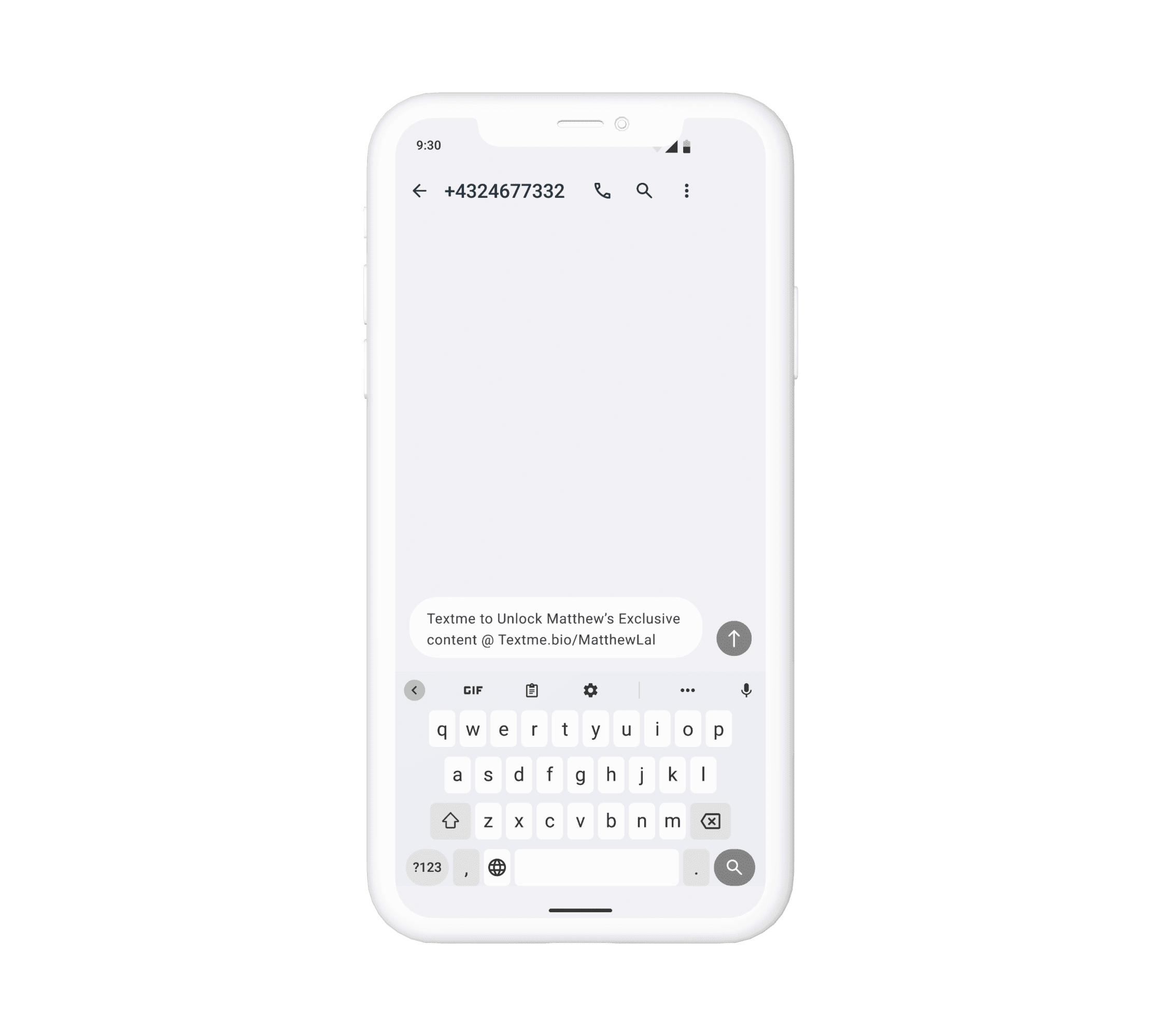
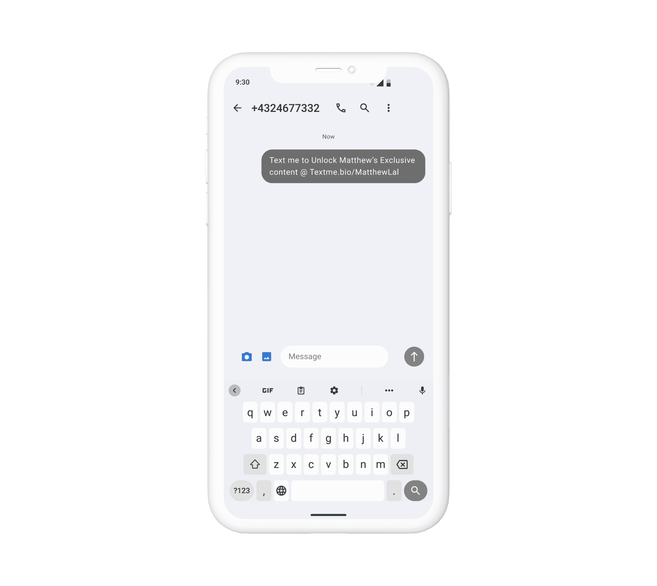
One of the first prototypes of the textme flow
Starting from a Simple Idea
Designed SMS unlock flow driving creator growth.
The vision for textme.bio was to help creators share content while building an SMS lead list using an SMS-to-unlock flow. Users unlocked links and accessed the bio by signing up via SMS.
The link-in-bio format was chosen for its simplicity in development and its growing popularity in the creator space.
My role began with creating a prototype that allowed users to unlock content with a single tap but expanded as I grew, learning valuable lessons along the way.
SMS is better than email
Validated the idea and market fit.
98%
open rate
vs. email’s 20%
45%
respond within 5 minutes
2x
conversion rate compared to email
One major opportunity identified was SMS marketing, which offers a more personal and direct connection with clients compared to email, addressing the need for better audience engagement.
We used these insights to develop a prototype that simplifies their workflows and helps creators better connect with their audience, while ensuring compliance with SMS regulations to keep their business secure and legal in Canada, America and the EU.
80%
71%
60%
The Problems
Simple, Scalable, and Flexible
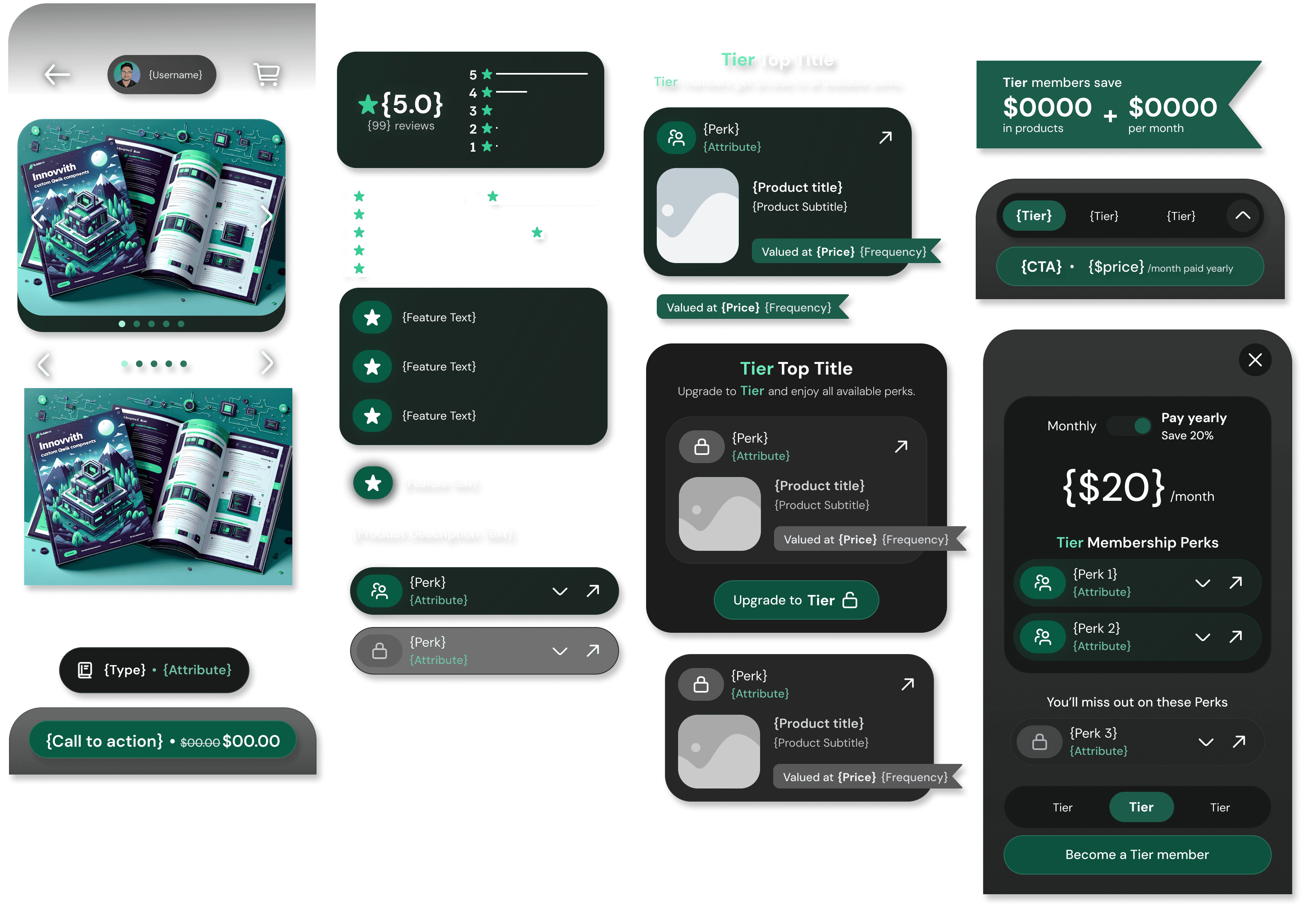
Create an extendable design system that is themable
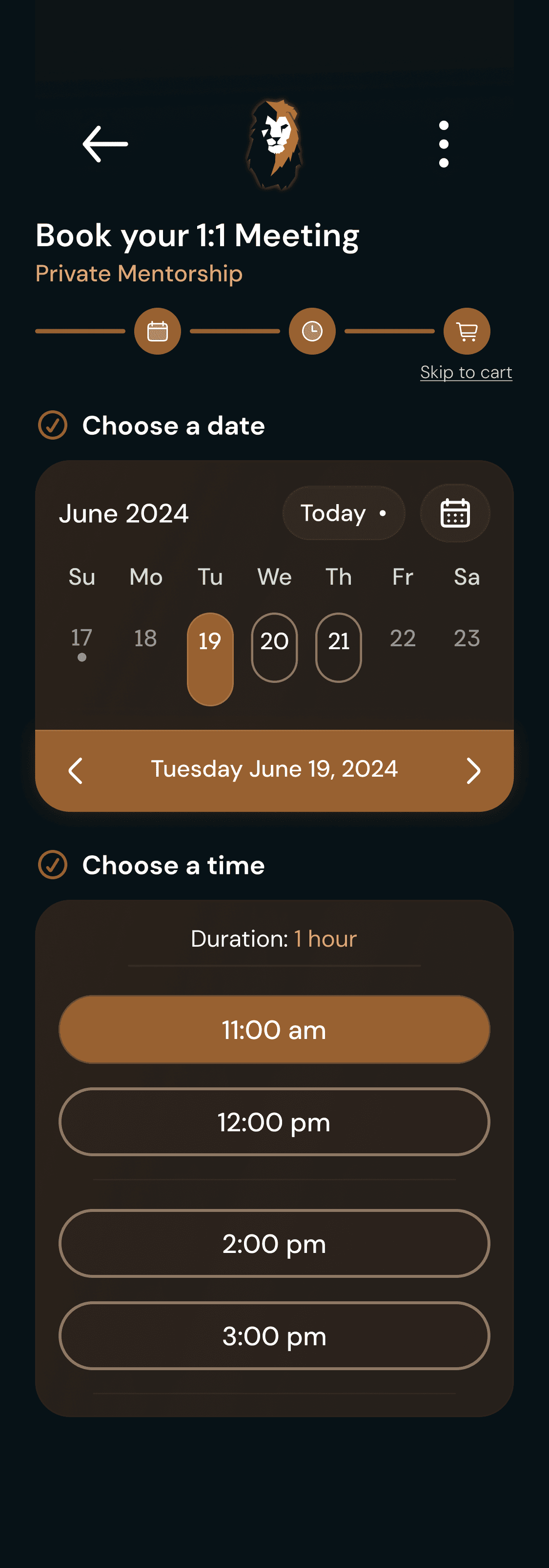
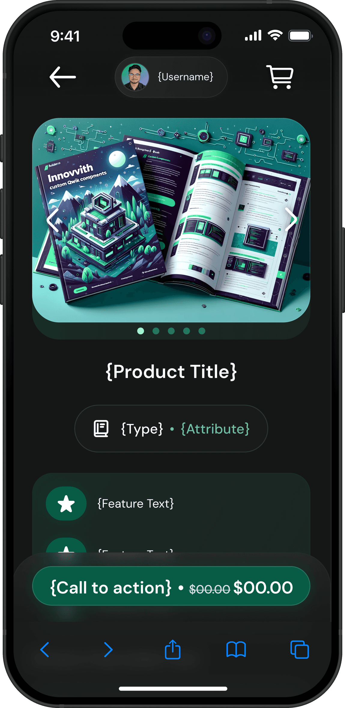
Each screen was designed using dynamic auto layouts to easily update or add components in Builder.io's drag-and-drop editor.
Consistency was maintained by establishing clear rules for spacing, typography, and color, ensuring clarity across all elements.
The system was built for future scalability, allowing features like widgets in the members' area to be added seamlessly while maintaining an identity throughout the experience.
Minimizing screens and flows simplified both the user experience and development, while making it feel small making the system more intuitive, efficient and personal.
800+
150+
Everything you see here is dev-ready and uses auto layout to enable dynamic content.
Simple Customization for Personal Branding
A flexible system allowing creators to customize their branding without complexity.
I developed a 3-color system to simplify customization, giving creators control over the primary color (action elements), secondary color (background), and tertiary color (accents).
This system balances flexibility with simplicity, letting creators choose up to three colors to match their brand without overwhelming them.
This approach resolves a key pain point by enabling creators to personalize their audience's entire experience while keeping the design intuitive and user-friendly.
I used design tokens to prepare for future customization, exposing elements like fonts and border radius. Currently, only the primary color is customizable for the MVP, with plans to expand customization later.
Here are some aspects of the planned theming system:
Accessible and Scalable Theming (Hue System)
Built with accessibility and future scalability in mind.
Accessibility was a priority, with contrast checks and minimum text sizes ensuring legibility across all color choices.
The mono-hue system allowed developers to easily modify colors using CSS variables, simplifying customization while maintaining flexibility.
This approach ensures scalability as we integrate design tokens to support additional layers of customization like fonts and spacing.
The hue system provides dynamic color changes, allowing developers to adjust hues programmatically, simplifying development and keeping the system adaptable.
Live Hue System Demo
Below is a live demo of the hue system, showcasing how colors dynamically shift and apply to all screens aligned with the creator's personal branding.
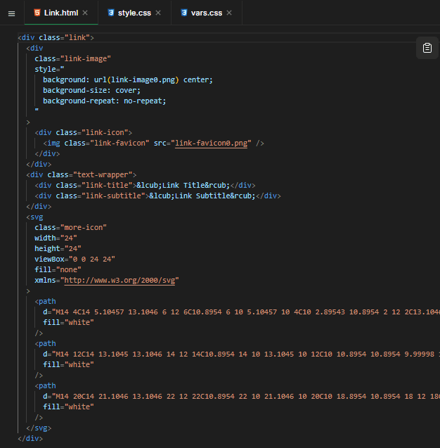
I developed clear conventions in Figma to streamline the design-to-code process, labeling layers with "{}" for text that required backend binding and "[]" for dynamic components.
These conventions allowed developers to focus on coding functionality rather than spending time clarifying design details. This reduced back-and-forth communication by around 50%, making the process more efficient.
It simplified the handoff, giving developers more freedom to focus on building the features that added value to the end user.
Utilizing Figma's dev-mode documentation I supplemented the design to include and critical information within the design itself, centralizing it as the source of truth for the product.
Designing Responsively:
Mobile focused for Dynamic Content
Building adaptable designs that save development time.
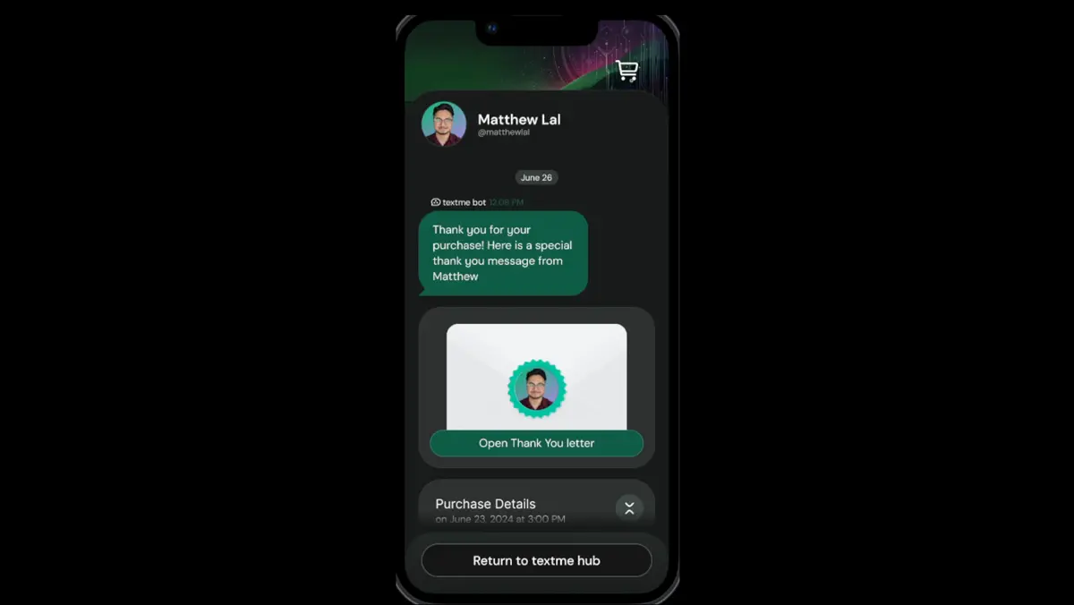
I designed all screens to handle dynamic content while ensuring they remained responsive across different mobile screen sizes.
To ensure consistency across all mobile devices, I worked closely with developers to implement a scaling function using REM, which allowed the design to adapt seamlessly to different screen sizes without requiring separate layouts.
This saved both time and resources, as we only needed to design for one mobile screen and apply the scaling function across various devices. It also ensured that users had a consistent experience, regardless of the device they were using.
By focusing on flexibility and responsiveness, I took on the front-end design tasks, reducing the workload for developers and allowing them to concentrate on binding dynamic data and refining core functionality.
Reflections and the Future
Starting from scratch on textme.bio came with countless challenges—often, I didn’t have all the answers, but I learned to adapt and push forwardThis project taught me to see design from a platform and startup perspective. Transforming complex goals into a clear, flexible, themeable design system. Every obstacle sharpened my skills and strengthened my confidence in leveraging my technical background.
I’m so proud of the progress I’ve made, but I’m even more excited about what’s ahead. As I refine the design system and expand theming capabilities, I’m constantly learning and growing. This journey has fueled my enthusiasm to keep developing solutions that balance simplicity, scalability, and a creator-focused experience.


